Project Title
Simplifying Navigation and Enhancing Content Interaction on Instagram Lite
2024

Personal Story
As a product designer passionate about simplifying and enhancing digital experiences, I’ve always admired Instagram for its global impact. However, as a regular user and designer,
I noticed areas where the app could improve its usability. These issues, though seemingly small, affected how users interacted with the platform daily.
This inspired me to redesign parts of the Instagram app to create a more intuitive, user-centric experience while staying true to the platform's core values.
Problem and Opportunity
Instagram has evolved significantly, but certain UX patterns were causing friction for users. Navigation was cluttered, and key features lacked intuitive visual cues.
Plus, creators needed more tools to streamline their content creation process, such as captions. My goal was to address these pain points while maintaining the platform's sleek aesthetic and functionality.
Understanding the Problems
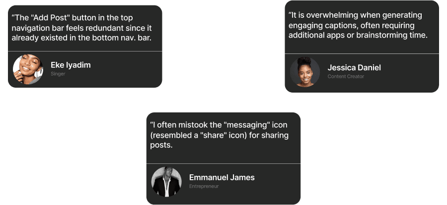
To understand the challenges, I conducted user interviews and usability tests with 15 frequent Instagram users. Participants ranged from casual users to creators, offering a broad perspective on the app’s usability.
Problem Definition
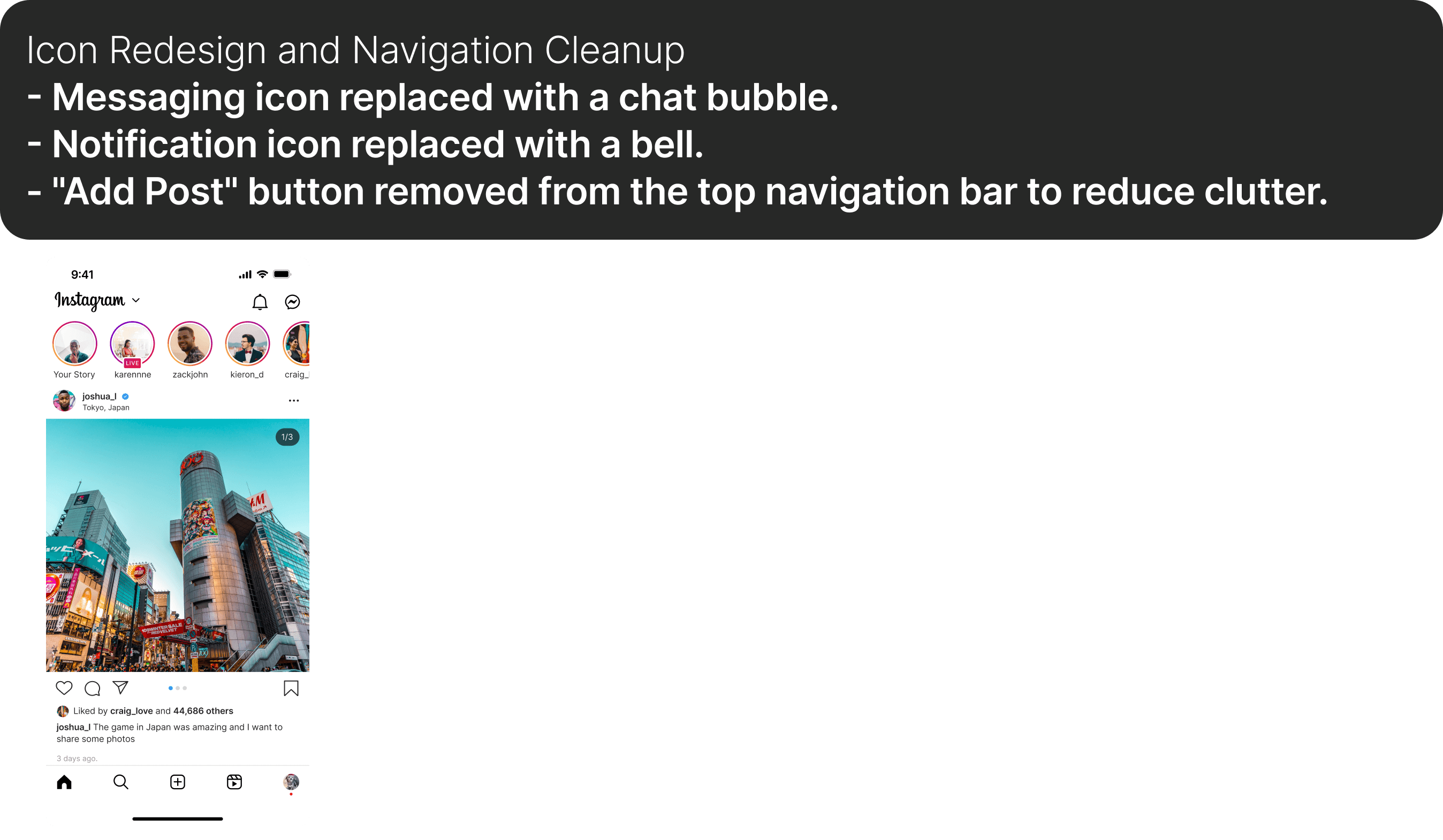
Icon Clarity
Misleading and inconsistent icons made navigation less intuitive.
Navigation Cluster
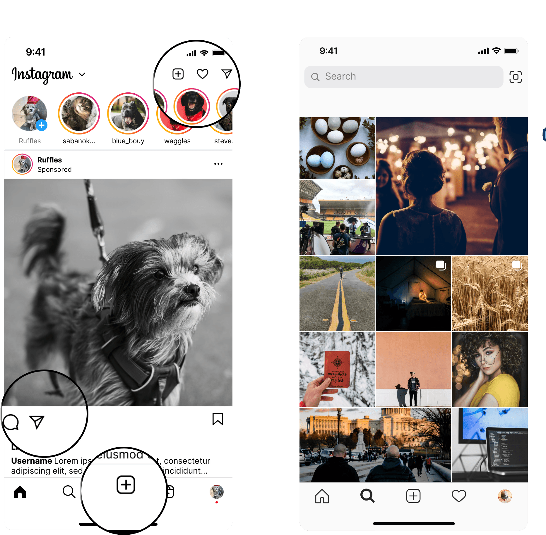
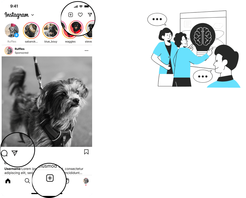
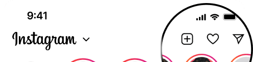
Overlapping functionalities in the top navigation bar created visual and functional redundancy.
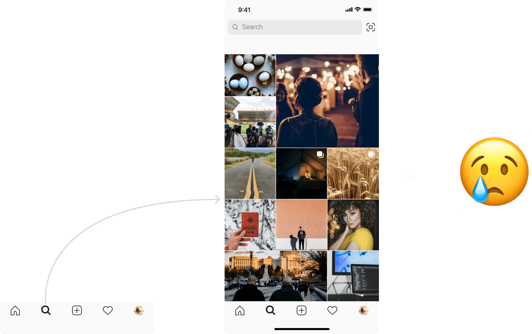
Navigation Cluster
Overlapping functionalities in the top navigation bar created visual and functional redundancy.
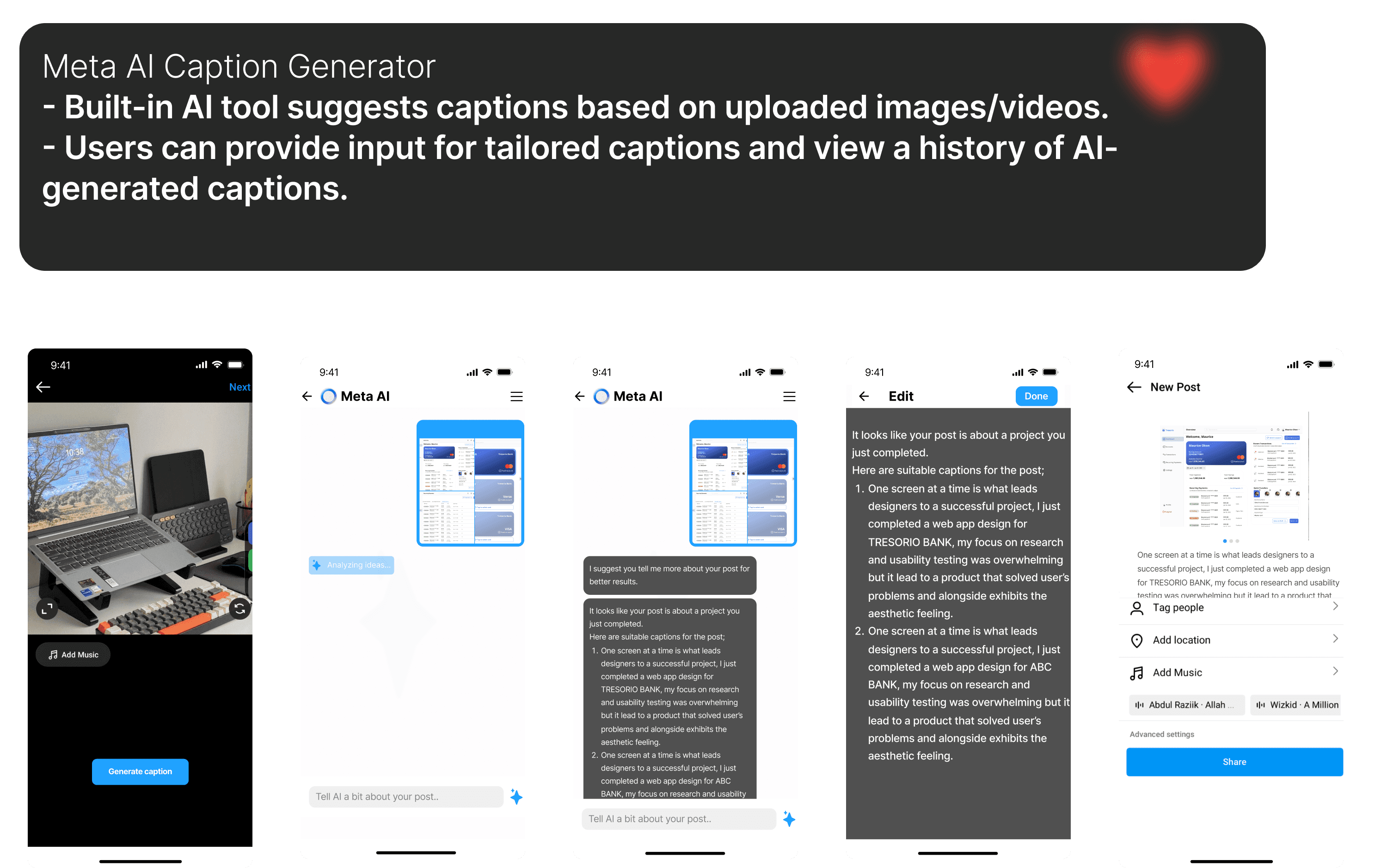
Creator’s Challenges
Lack of built-in tools for content creation, especially for generating captions.
Design Goals
- Simplify navigation by decluttering and redesigning key elements.
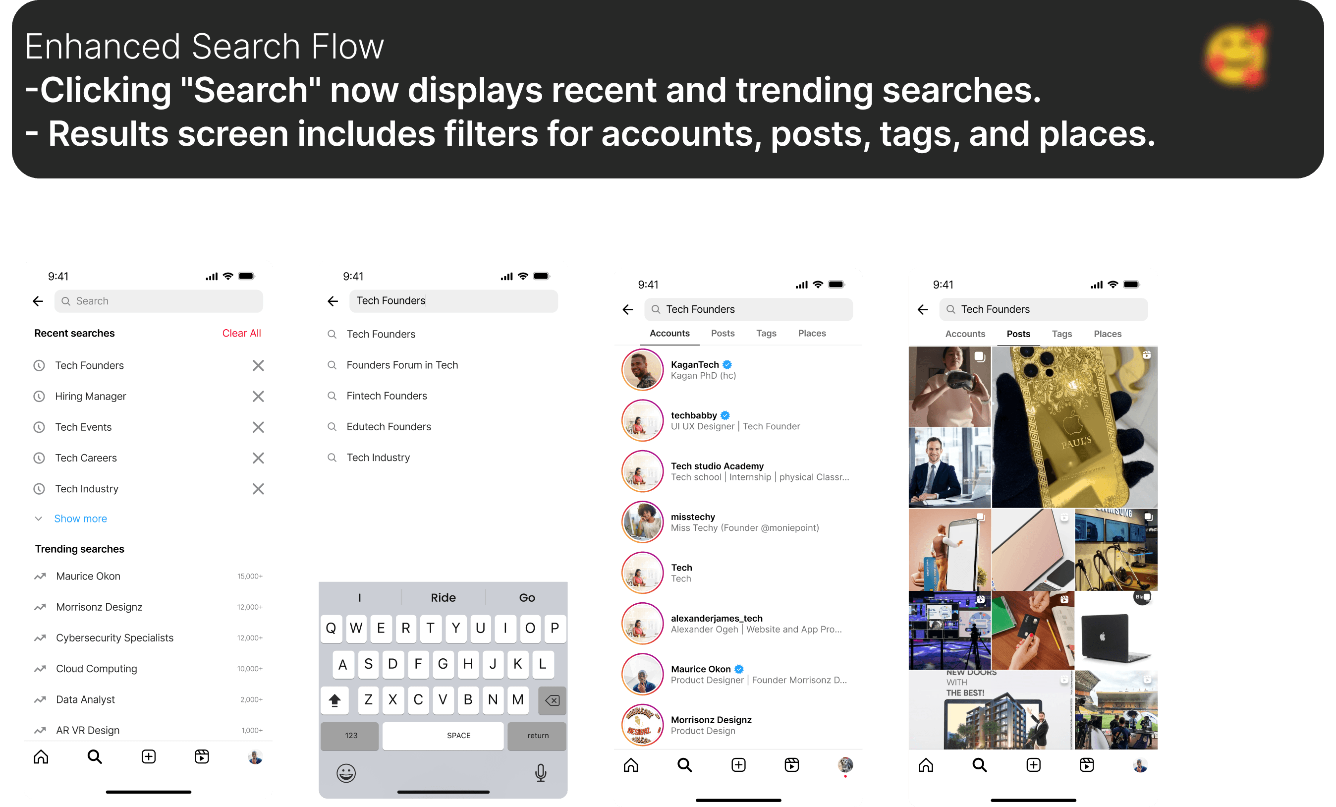
- Enhance search functionality to align with user expectations.
- Provide creators with tools to streamline their content creation process.
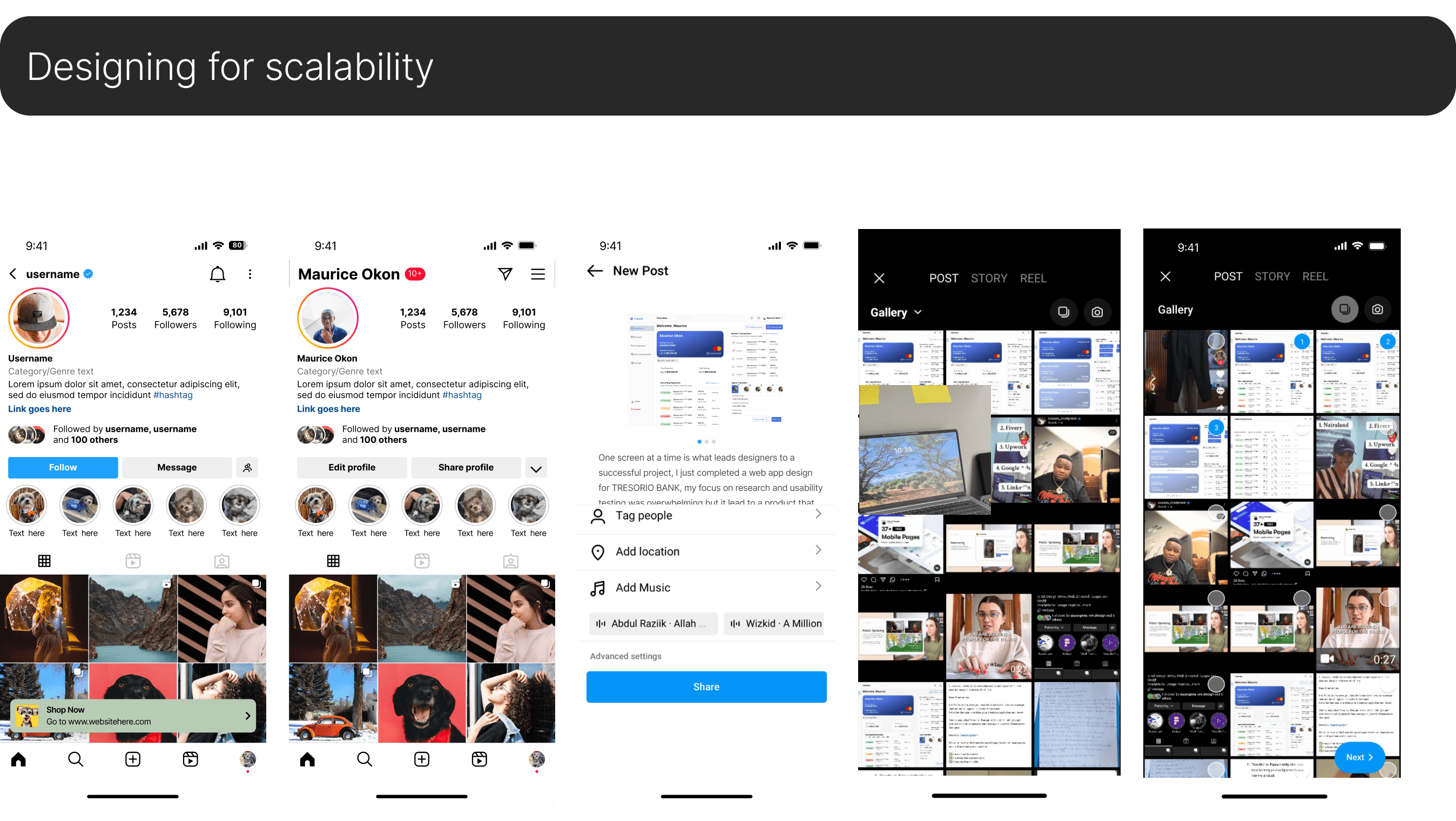
- Maintain Instagram’s visual identity while improving usability.
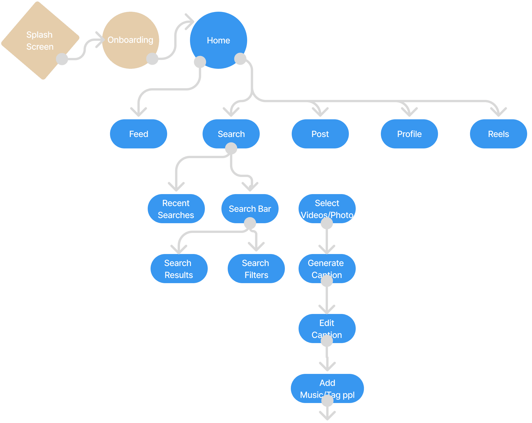
Final Designs


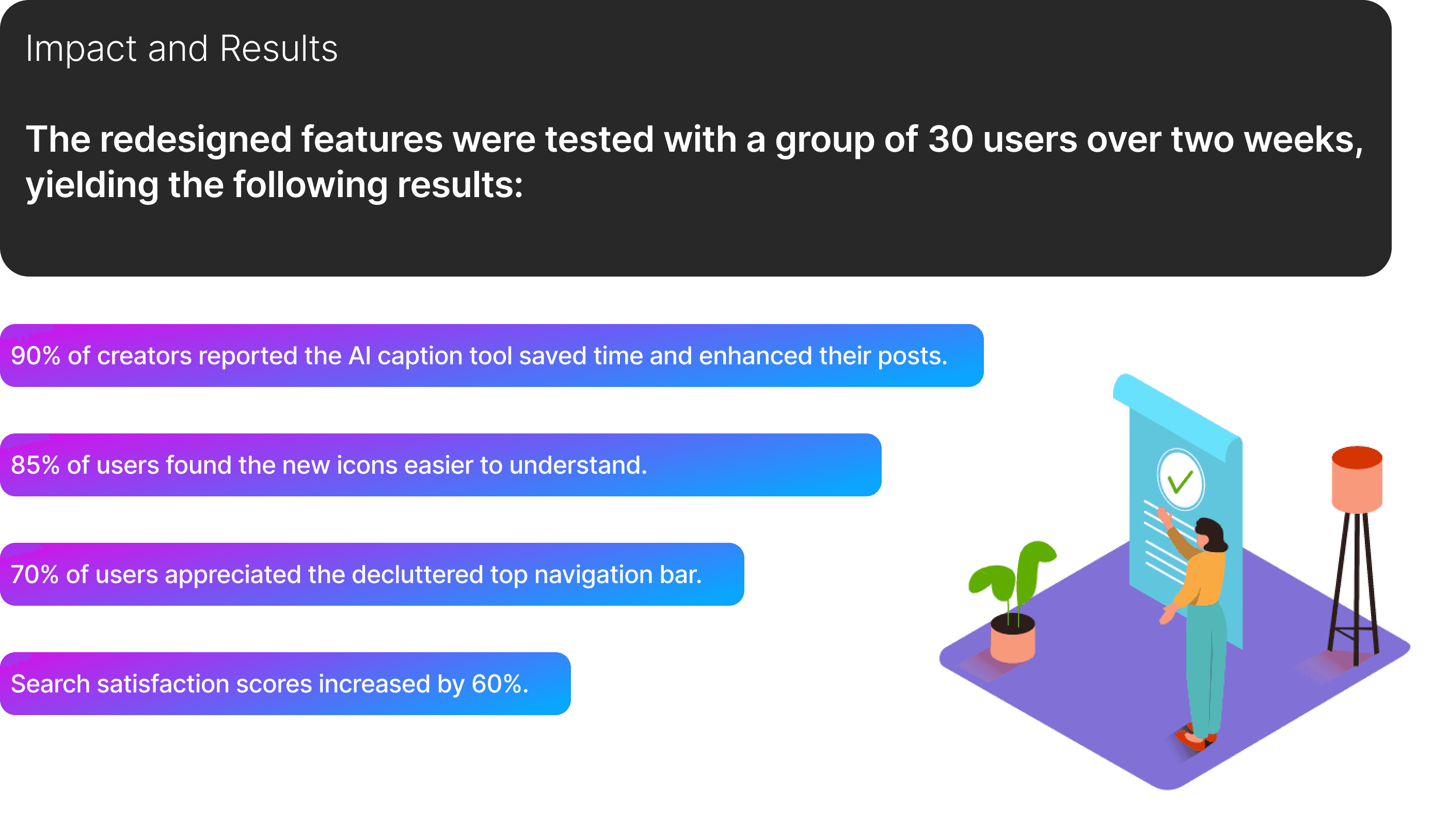
📮
Don’t Miss a Beat
Subscribe now and be the first to know about new projects, design tips, and everything in between.


500+ subscribers
Project Title
Simplifying Navigation and Enhancing Content Interaction on Instagram Lite
2024
Personal Story
As a product designer passionate about simplifying and enhancing digital experiences, I’ve always admired Instagram for its global impact. However, as a regular user and designer,
I noticed areas where the app could improve its usability. These issues, though seemingly small, affected how users interacted with the platform daily.
This inspired me to redesign parts of the Instagram app to create a more intuitive, user-centric experience while staying true to the platform's core values.
Problem and Opportunity
Instagram has evolved significantly, but certain UX patterns were causing friction for users. Navigation was cluttered, and key features lacked intuitive visual cues.
Plus, creators needed more tools to streamline their content creation process, such as captions. My goal was to address these pain points while maintaining the platform's sleek aesthetic and functionality.
Understanding the Problems
To understand the challenges, I conducted user interviews and usability tests with 15 frequent Instagram users. Participants ranged from casual users to creators, offering a broad perspective on the app’s usability.
Problem Definition
Icon Clarity
Misleading and inconsistent icons made navigation less intuitive.
Navigation Cluster
Overlapping functionalities in the top navigation bar created visual and functional redundancy.
Navigation Cluster
Overlapping functionalities in the top navigation bar created visual and functional redundancy.
Creator’s Challenges
Lack of built-in tools for content creation, especially for generating captions.
Design Goals
- Simplify navigation by decluttering and redesigning key elements.
- Enhance search functionality to align with user expectations.
- Provide creators with tools to streamline their content creation process.
- Maintain Instagram’s visual identity while improving usability.
Final Designs
📮
Don’t Miss a Beat
Subscribe now and be the first to know about new projects, design tips, and everything in between.
500+ subscribers