Project Title
Improving Recurring Payments and Subscriptions in Tresorio Bank Web App
Tresorio Finance Web App
2024

Personal Story
As a UI/UX designer, I’ve always been passionate about solving real-world problems with intuitive and user-friendly designs.
My journey with the Tresorio Bank web app began after I encountered numerous feedback about users struggling to manage their recurring payments and subscriptions effectively. Many expressed frustration with the lack of clarity and control over their scheduled transactions.
After hearing their challenges, I realized this was an opportunity to enhance the user experience by not only improving how recurring payments are managed but also adding a proactive feature that would empower users to manage their finances with more confidence. The idea to introduce a notification system that alerts users ahead of time—giving them a heads-up before payments were made—became the centerpiece of this redesign.
About the Brand
Tresorio Bank is a growing digital bank that offers a wide range of services to its users, from personal banking to investment opportunities.
However, despite its sleek platform, many users found the process of managing recurring payments like subscriptions, memberships, and utility bills cumbersome. The app’s lack of transparency and control over these transactions led to customer frustration, particularly when payments were automatically deducted without prior warning.
Tresorio
Tresorio
Tresorio
Tresorio
Tresorio
Tresorio
The Problem Focus
This project aimed to address the challenge users were facing in managing recurring payments and subscriptions within the Tresorio Bank web app.
Users found it difficult to track their subscriptions and were often caught off guard when payments were deducted. The task was to design a solution that made recurring payments more visible and manageable, with the added feature of proactive alerts sent to users before the transaction occurred.
Business Challenge
Due to these frustrations, users were more likely to cancel subscriptions or switch to competitors. The lack of foresight regarding upcoming payments created a negative user experience, which directly impacted customer retention. By addressing this pain point, Tresorio Bank could improve user satisfaction and reduce the churn rate.
Research
To better understand how users were interacting with the recurring payments and subscriptions feature, I conducted research using a combination of surveys and user interviews. I gathered insights from both existing customers and new users of the web app.
The user survey was distributed through Google Forms, and Zoom meetings were held with stakeholders to gather further insights into the business objectives.
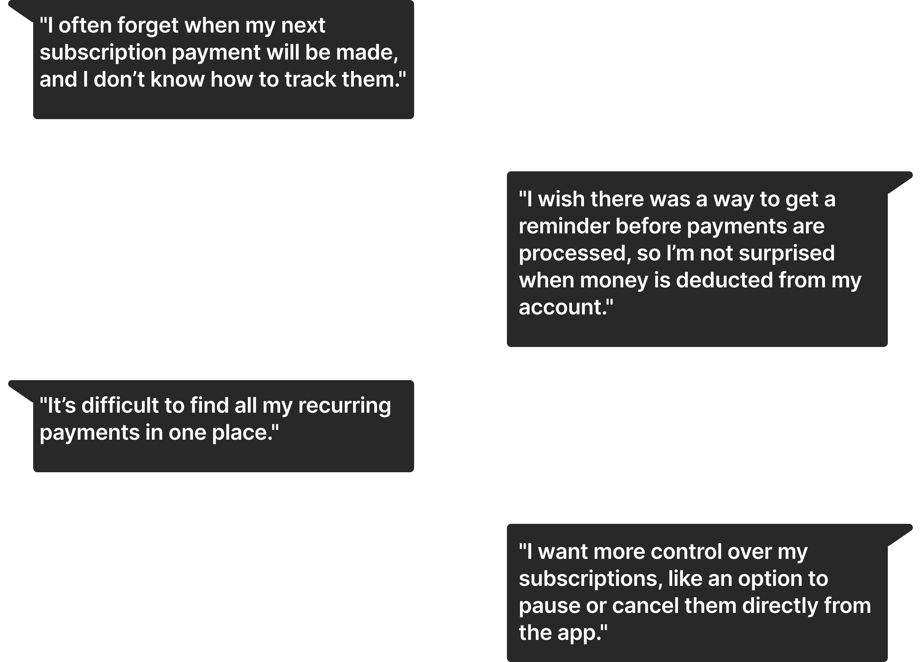
What 'USERS' were saying'
What 'STAKEHOLDERS' were saying'
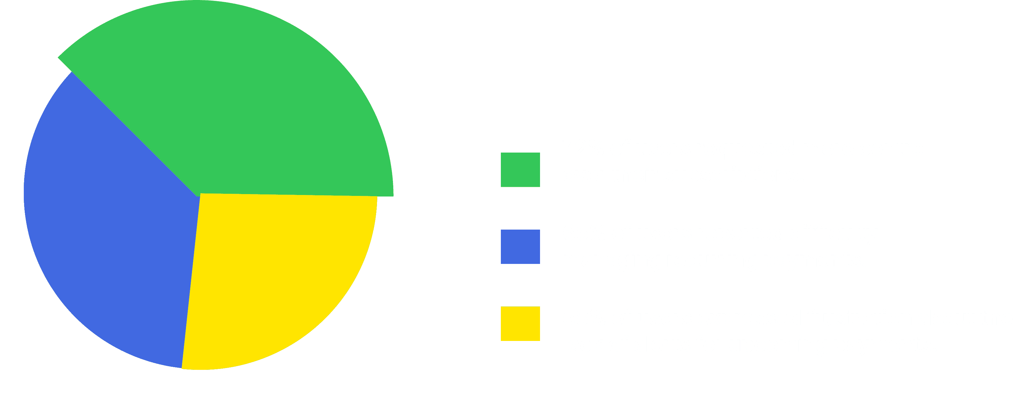
Research Results
Project Goals
From the research, it became clear that the main issues users were facing were:
- Lack of Visibility and Management: Users were struggling to find and manage recurring payments, often forgetting about upcoming payments.
- No Proactive Alerts: Users were not notified in advance of upcoming payments, leading to unexpected charges and frustrations.
- Limited Control: Users wanted more control over their subscriptions, like pausing or modifying them directly through the app.
Implement an intuitive dashboard for managing recurring payments, introduce 3-day advance notifications, and offer features to pause or cancel subscriptions.
Iterations
After defining the solutions, I created wireframes that showcased different ways to display recurring payments and integrate proactive alerts. I tested these with both users and stakeholders to refine the design.
Feedback: Users appreciated the ease of access but suggested clearer visibility of the alert feature.
Feedback: Users liked the advance alert but suggested the option to reschedule or modify the payment within the notification.
Feedback: Users were excited about the new features and z them highly useful for managing their finances.
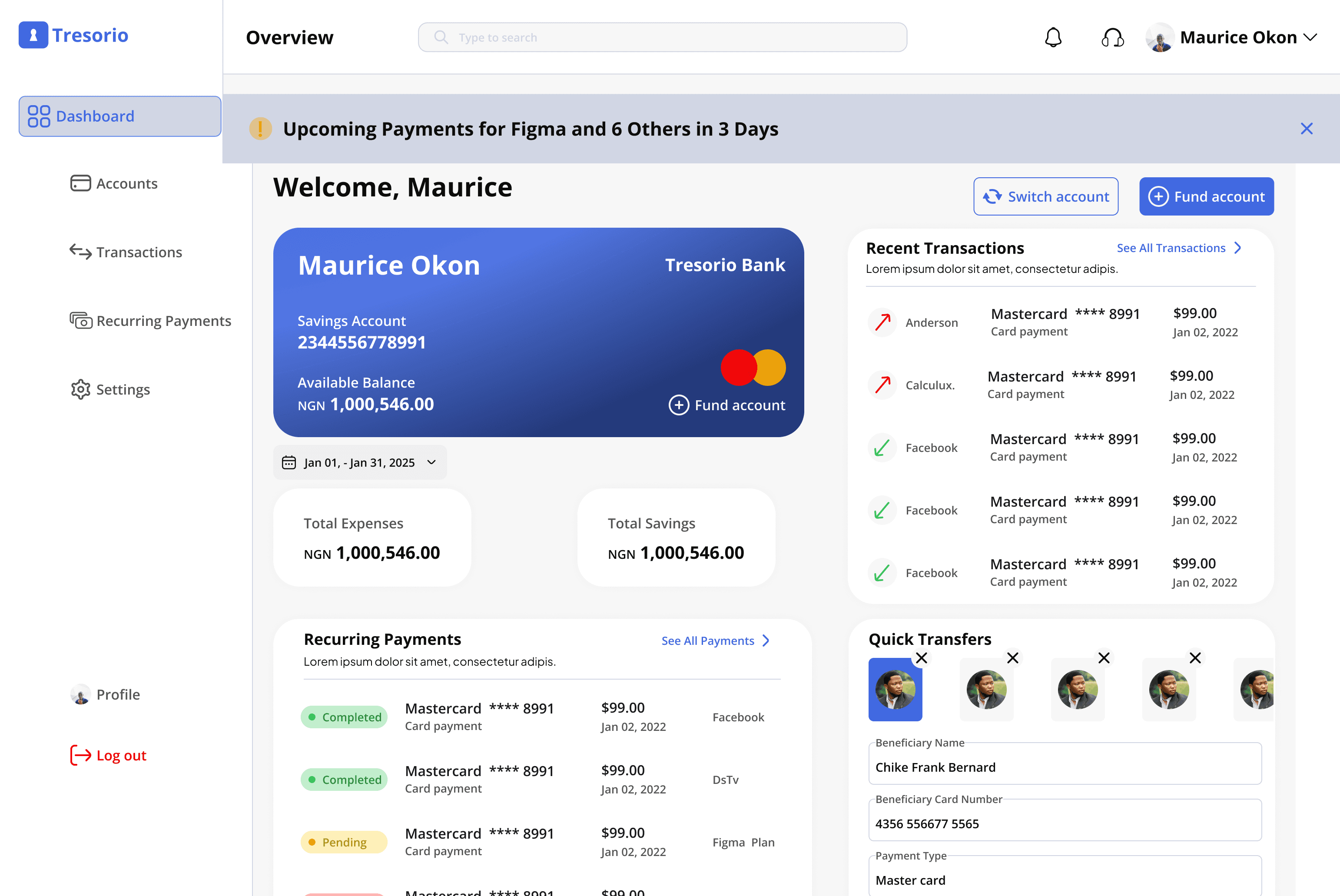
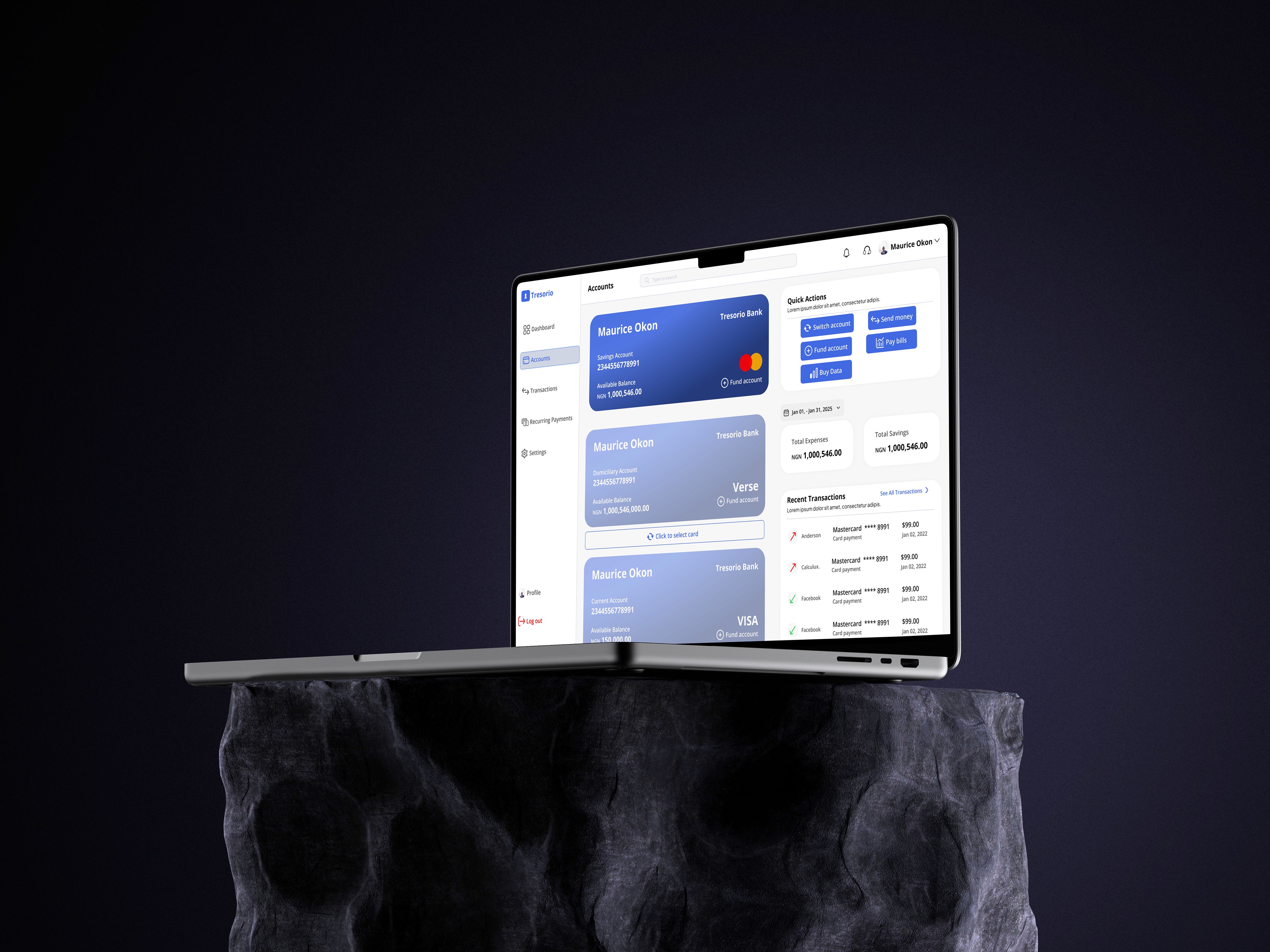
Final solutions
The final design incorporated the following key features:
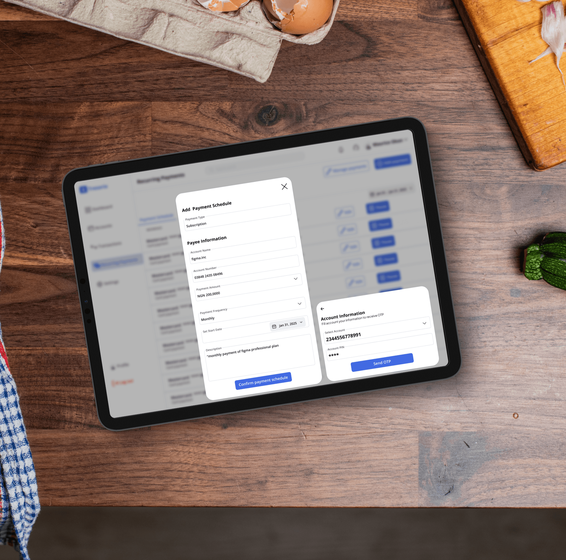
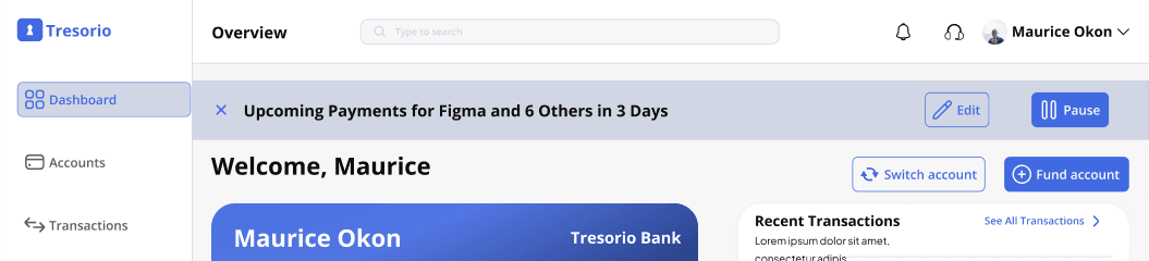
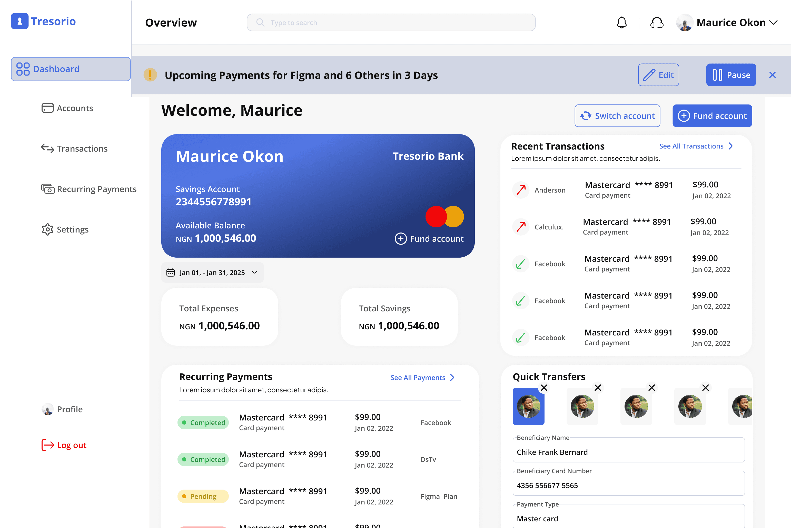
Proactive Alerts

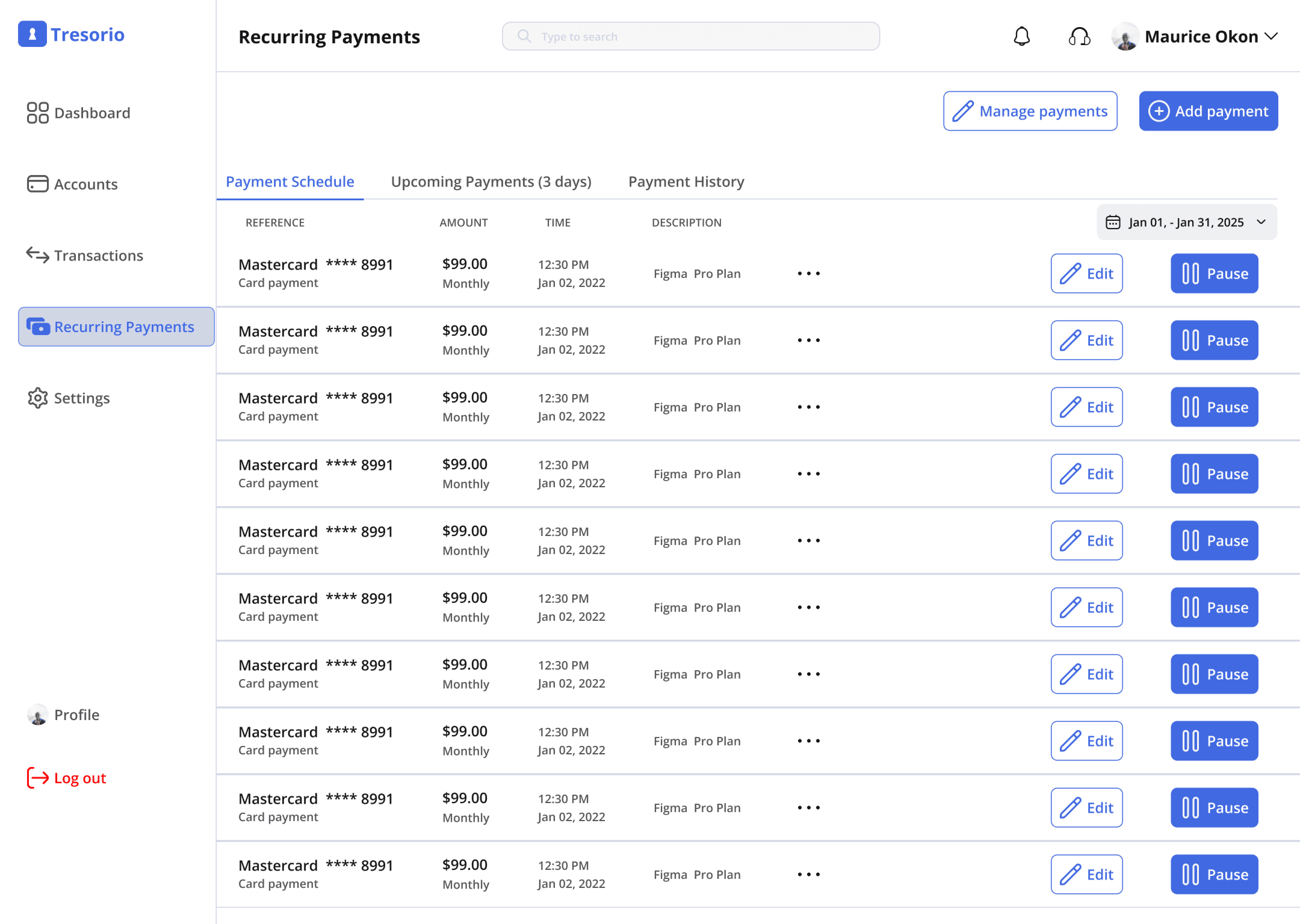
Subscribtion/Recurring Payment Dashboard

Use Cases
The user (James) needs to edit his recurring payments details
The "user" navigates through the recurring payments dashboard.
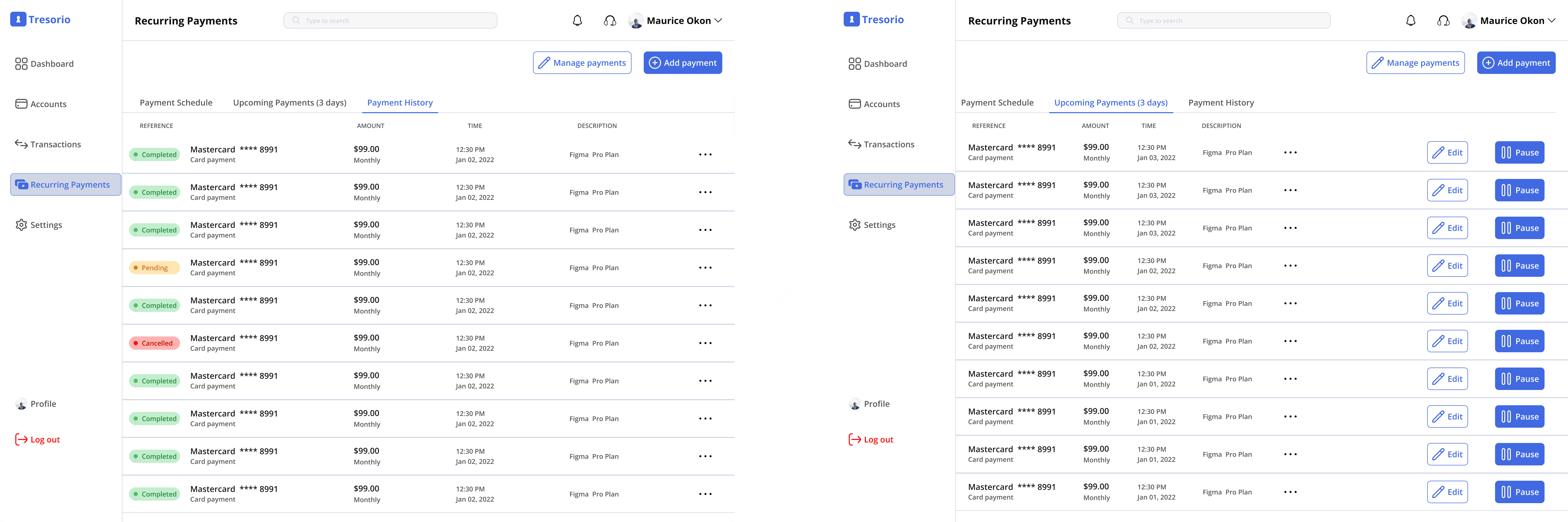
The "user" chooses which payment schedule he wants to edit James can now edit his payment schedule with ease.
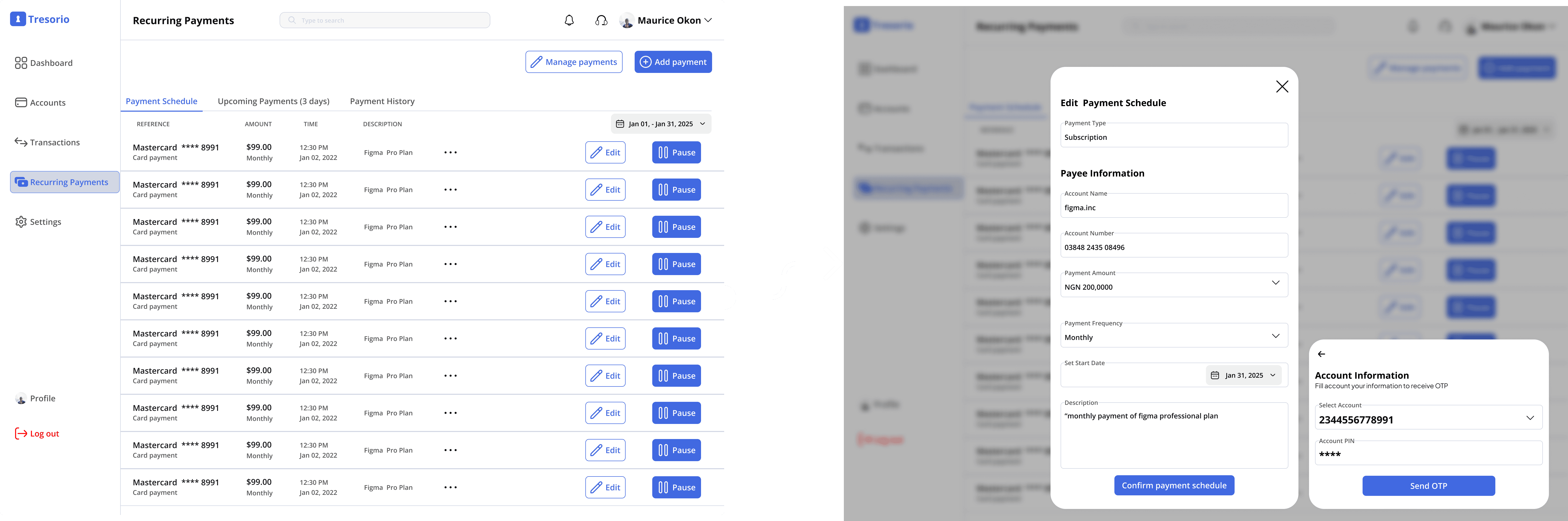
The user (James) wants to add a new payment/subscription schdule
The "user" finds the 'Add payment button and execute his task
The user (James) wants to delete some subscriptions and payments
The "user" finds the "manage payment button and execute his task
User Control

Design Systems
I created a components library which made my workflow a lot easier.
Impact and Final Outcome
User satisfaction:
Increased by 35%, with users reporting they felt more in control of their recurring payments.
Engagement:
Subscription management interaction increased by 40%, with users actively pausing or modifying their subscriptions.
what I learned
Solving a big UX challenge like this was overwhelming when I began the project especially without a design system.
So I realized I needed one, after creating the UI components Library and Design system the work became a lot easier for me.
This case study demonstrates how thoughtful UX/UI design can address pain points, create proactive solutions, and enhance overall customer satisfaction in the fintech industry.
📮
Don’t Miss a Beat
Subscribe now and be the first to know about new projects, design tips, and everything in between.


500+ subscribers
📮
Don’t Miss a Beat
Subscribe now and be the first to know about new projects, design tips, and everything in between.
500+ subscribers
Project Title
Improving Recurring Payments and Subscriptions in Tresorio Bank Web App
Tresorio Finance Web App
2024
Personal Story
As a UI/UX designer, I’ve always been passionate about solving real-world problems with intuitive and user-friendly designs.
My journey with the Tresorio Bank web app began after I encountered numerous feedback about users struggling to manage their recurring payments and subscriptions effectively. Many expressed frustration with the lack of clarity and control over their scheduled transactions.
After hearing their challenges, I realized this was an opportunity to enhance the user experience by not only improving how recurring payments are managed but also adding a proactive feature that would empower users to manage their finances with more confidence. The idea to introduce a notification system that alerts users ahead of time—giving them a heads-up before payments were made—became the centerpiece of this redesign.
About the Brand
Tresorio Bank is a growing digital bank that offers a wide range of services to its users, from personal banking to investment opportunities.
However, despite its sleek platform, many users found the process of managing recurring payments like subscriptions, memberships, and utility bills cumbersome. The app’s lack of transparency and control over these transactions led to customer frustration, particularly when payments were automatically deducted without prior warning.
Tresorio
Tresorio
Tresorio
Tresorio
Tresorio
Tresorio
Tresorio
Tresorio
Tresorio
Tresorio
Tresorio
Tresorio
The Focus Problem
This project aimed to address the challenge users were facing in managing recurring payments and subscriptions within the Tresorio Bank web app. Users found it difficult to track their subscriptions and were often caught off guard when payments were deducted. The task was to design a solution that made recurring payments more visible and manageable, with the added feature of proactive alerts sent to users before the transaction occurred.
Business Challenge
Due to these frustrations, users were more likely to cancel subscriptions or switch to competitors. The lack of foresight regarding upcoming payments created a negative user experience, which directly impacted customer retention. By addressing this pain point, Tresorio Bank could improve user satisfaction and reduce the churn rate.
Research
To better understand how users were interacting with the recurring payments and subscriptions feature, I conducted research using a combination of surveys and user interviews. I gathered insights from both existing customers and new users of the web app.
The user survey was distributed through Google Forms, and Zoom meetings were held with stakeholders to gather further insights into the business objectives.
What 'USERS' were saying'
What 'STAKEHOLDERS' were saying'
The most important user feedback was the request for alerts sent in advance—preferably 3 days before the transaction—so users could manage their payments without surprises.
Research Results
From the research, it became clear that the main issues users were facing were:
- Lack of Visibility and Management: Users were struggling to find and manage recurring payments, often forgetting about upcoming payments.
- No Proactive Alerts: Users were not notified in advance of upcoming payments, leading to unexpected charges and frustrations.
- Limited Control: Users wanted more control over their subscriptions, like pausing or modifying them directly through the app.
Project Goals
Project Goals
Implement an intuitive dashboard for managing recurring payments, introduce 3-day advance notifications, and offer features to pause or cancel subscriptions.
Implement an intuitive dashboard for managing recurring payments, introduce 3-day advance notifications, and offer features to pause or cancel subscriptions.
Iterations
After defining the solutions, I created wireframes that showcased different ways to display recurring payments and integrate proactive alerts. I tested these with both users and stakeholders to refine the design.
Feedback: Users appreciated the ease of access but suggested clearer visibility of the alert feature.
Feedback: Users liked the advance alert but suggested the option to reschedule or modify the payment within the notification.
Feedback: Users were excited about the new features and found them highly useful for managing their finances.
Final solutions
The final design incorporated the following key features:
Proactive Alerts
Subscribtion/Recurring Payment Dashboard
User Control
Use Cases
The user (James) needs to edit his recurring payments details
The "user" navigates through the recurring payments dashboard.
The "user" chooses which payment schedule he wants to edit James can now edit
his payment schedule with ease.
The user (James) wants to add a new payment/subscription schdule
The "user" finds the 'Add payment button and execute his task
The user (James) wants to delete some subscriptions and payments
The "user" finds the "manage payment button and execute his task
Design Systems
I created a components library which made my workflow a lot easier.
Impact and Final Outcome
User satisfaction:
Increased by 35%, with users reporting they felt more in control of their recurring payments.
Engagement:
Subscription management interaction increased by 40%, with users actively pausing or modifying their subscriptions.
what I learned
Solving a big UX challenge like this was overwhelming when I began the project especially without a design system.
So I realized I needed one, after creating the UI components Library and Design system the work became a lot easier for me.
This case study demonstrates how thoughtful UX/UI design can address pain points, create proactive solutions, and enhance overall customer satisfaction in the fintech industry.
📮
Don’t Miss a Beat
Subscribe now and be the first to know about new projects, design tips, and everything in between.
500+ subscribers